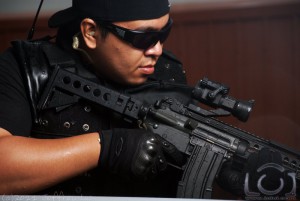
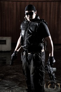
 I rarely do heavy post-processing on my work. All I usually do when I get my photos from my camera to the computer is convert them from RAW and do a little bit of curve adjustments and white balance tweaking, and that’s it! Take for example the picture on the left. From the camera, the photo is already how I would want it to be. I wouldn’t call myself a purist, but I’ve been called that a couple of times.
Back in the days of film, when I was still learning, I didn’t have my own darkroom. So whatever post-processing the lab was capable of, such as color adjustment and push-processing, was applied to the whole shot. No dodging, no burning, no enhancing features and cloning out flaws. When I do my RAW conversion, that’s basically what I do as well–curves for color adjustments, white balance, and exposure adjustments (kinda like push-processing).
Check out the rest of the photos in our Facebook Page!
More on the gun shoot after the jump.
 But rather than think of post-processing as a “no fly zone”, I believe it just means there’s an avenue for artistic expression that hasn’t been fully explored yet, at least for me. Photographers like Parc Cruz for example, clearly know when to use it and when not to. This Pepsi Ad, however, does not. And again when a photographer decides that his Photoshop skills are more important than his photography skills, I just roll my eyes. Post-processing isn’t meant to hide your lack of skill, it’s supposed to enhance your creativity. If you’re still having trouble with your exposures and lights, then learning mad skillz in Photoshop should be the least of your worries. Post-processing is meant to be used as a tool to more effectively convey a message, but the message should already be clear in the first place.
So when a friend of mine asked me to do a shoot of him and the guns he was selling, I thought that this was the perfect opportunity to get out of my comfort zone.
Even before I got to the location, I knew that the style of lighting this would be a bit different than how I would normally light. As a photographer, or whatever kind of artist you are, I believe that you have to be quite clear about the result you want to achieve. And when you’re going for this rough, gritty look, standard portrait lighting just won’t cut it. Most of the stuff I shot was lit hard with two lights to get that high-contrast menacing feel to them.
Since I use GIMP and most of the tutorials use Photoshop, it took quite a bit to Google everything. A lot of times, things just don’t translate very well. But in the end, I found a technique that didn’t involve additional plugins and was extremely simple from a chap on Yahoo!Answers. Personally, I had to tone down the C2G’ed layer’s opacity and I only reduced my saturation by -40 in some photos (lots of bad examples of this technique here). Further expanding on the technique, I used mixed (de)saturation levels on some images to emphasize the subject, while in some photos I made use of black and white.
 But where I had the most fun, and also took the most time on, was this photo on the left. I still created the desaturated layer and the black and white duplicate as an overlay, but I also added lots of smoke. I just used the built-in Filters>Render>Clouds>Fog, bumped up the turbulence a few, and added a layer mask so that I could control where I wanted smoke to be.
Unfortunately, I couldn’t set a beat-down car on fire at the location so again this had to be done in post. I simply added them into a separate layer and created a layer mask so they blended in nicely in the scene.
Well, what I’ve learned today was that post-processing, when needed, is actually fun, albeit more time-consuming than I would want it to be. I still prefer shooting it right on camera, but here’s something to add to my bag of tricks.
Check out the rest of the photos in our Facebook Page!


